| Главная » Файлы » Прочие скрипты » CSS |
Классные стильные кнопочки на чистом css для uCoz
| 26.10.14, 09:27:52 | |
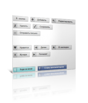 Классные кнопочки на чистом css, в которых даже иконки используются из спецсимволов. В общем, забирайте, пока не растащили! Для начала посмотрите ДЕМО Моё тестирование в фидле: КЛИК Установка: В самый низ вашего css вставляйте: Код .button { display: inline-block; white-space: nowrap; background-color: #ddd; background-image: -webkit-gradient(linear, left top, left bottom, from(#eee), to(#ccc)); background-image: -webkit-linear-gradient(top, #eee, #ccc); background-image: -moz-linear-gradient(top, #eee, #ccc); background-image: -ms-linear-gradient(top, #eee, #ccc); background-image: -o-linear-gradient(top, #eee, #ccc); background-image: linear-gradient(top, #eee, #ccc); border: 1px solid #777; padding: 0 1.5em; margin: 0.5em; font: bold 1em/2em Arial, Helvetica; text-decoration: none; color: #333; text-shadow: 0 1px 0 rgba(255, 255, 255, .8); -moz-border-radius: .2em; -webkit-border-radius: .2em; border-radius: .2em; -moz-box-shadow: 0 0 1px 1px rgba(255, 255, 255, .8) inset, 0 1px 0 rgba(0, 0, 0, .3); -webkit-box-shadow: 0 0 1px 1px rgba(255, 255, 255, .8) inset, 0 1px 0 rgba(0, 0, 0, .3); box-shadow: 0 0 1px 1px rgba(255, 255, 255, .8) inset, 0 1px 0 rgba(0, 0, 0, .3); } .button:hover { background-color: #eee; background-image: -webkit-gradient(linear, left top, left bottom, from(#fafafa), to(#ddd)); background-image: -webkit-linear-gradient(top, #fafafa, #ddd); background-image: -moz-linear-gradient(top, #fafafa, #ddd); background-image: -ms-linear-gradient(top, #fafafa, #ddd); background-image: -o-linear-gradient(top, #fafafa, #ddd); background-image: linear-gradient(top, #fafafa, #ddd); } .button:active { -moz-box-shadow: 0 0 4px 2px rgba(0, 0, 0, .3) inset; -webkit-box-shadow: 0 0 4px 2px rgba(0, 0, 0, .3) inset; box-shadow: 0 0 4px 2px rgba(0, 0, 0, .3) inset; position: relative; top: 1px; } .button:focus { outline: 0; background: #fafafa; } .button:before { background: #ccc; background: rgba(0, 0, 0, .1); float: left; width: 1em; text-align: center; font-size: 1.5em; margin: 0 1em 0 -1em; padding: 0 .2em; -moz-box-shadow: 1px 0 0 rgba(0, 0, 0, .5), 2px 0 0 rgba(255, 255, 255, .5); -webkit-box-shadow: 1px 0 0 rgba(0, 0, 0, .5), 2px 0 0 rgba(255, 255, 255, .5); box-shadow: 1px 0 0 rgba(0, 0, 0, .5), 2px 0 0 rgba(255, 255, 255, .5); -moz-border-radius: .15em 0 0 .15em; -webkit-border-radius: .15em 0 0 .15em; border-radius: .15em 0 0 .15em; pointer-events: none; } /* Buttons and inputs */ button.button, input.button { cursor: pointer; overflow: visible; /* removes extra side spacing in IE */ } /* removes extra inner spacing in Firefox */ button::-moz-focus-inner { border: 0; padding: 0; } /* If line-height can't be modified, then fix Firefox spacing with padding */ input::-moz-focus-inner { padding: .4em; } /* The disabled styles */ .button[disabled], .button[disabled]:hover, .button.disabled, .button.disabled:hover { background: #eee; color: #aaa; border-color: #aaa; cursor: default; text-shadow: none; position: static; -moz-box-shadow: none; -webkit-box-shadow: none; box-shadow: none; } /* Hexadecimal entities for the icons */ .add:before { content:"\271A"; } .edit:before { content:"\270E"; } .delete:before { content:"\2718"; } .save:before { content:"\2714"; } .email:before { content:"\2709"; } .like:before { content:"\2764"; } .next:before { content:"\279C"; } .star:before { content:"\2605"; } .spark:before { content:"\2737"; } .play:before { content:"\25B6"; } /* Social media buttons */ .tw, .fb, .tw:hover, .fb:hover { background-image: -webkit-gradient(linear, left top, left bottom, from(rgba(255, 255, 255, .5)), to(rgba(255, 255, 255, 0))); background-image: -webkit-linear-gradient(top, rgba(255, 255, 255, .5), rgba(255, 255, 255, 0)); background-image: -moz-linear-gradient(top, rgba(255, 255, 255, .5), rgba(255, 255, 255, 0)); background-image: -ms-linear-gradient(top, rgba(255, 255, 255, .5), rgba(255, 255, 255, 0)); background-image: -o-linear-gradient(top, rgba(255, 255, 255, .5), rgba(255, 255, 255, 0)); background-image: linear-gradient(top, rgba(255, 255, 255, .5), rgba(255, 255, 255, 0)); } .tw, .tw:focus { background-color: #88E1E6; } .fb, .fb:focus { background-color: #3C5A98; color: #fff; text-shadow: 0 1px 0 rgba(0, 0, 0, .4); } .tw:hover { background-color: #b1f0f3; } .fb:hover { background-color: #879bc3; } .tw:before { content:"t"; background: #91cfd3; background: rgba(0, 0, 0, .1); color: #fff; font-family: verdana; text-shadow: 0 1px 0 rgba(0, 0, 0, .4); } .fb:before { content:"f"; background: #4467ac; background: rgba(0, 0, 0, .1); color: #fff; text-shadow: 0 1px 0 rgba(0, 0, 0, .4); } Примеры кнопочек: Код <a href="" class="button">Я - кнопка</a> <a href="" class="button add">Добавить</a> <a href="" class="button edit">Редактировать</a> <a href="" class="button delete">Удалить</a> <a href="" class="button save">Сохранить</a> <a href="" class="button email">Отправить письмо</a> <br><br><br><br> <a href="" class="button like">Нравится</a> <a href="" class="button next">Далее</a> <a href="" class="button star">В закладки</a> <a href="" class="button spark">Жучара</a> <a href="" class="button play">Погнали!</a> <br><br><br><br> <a href="http://twitter.com/catalinred" class="button tw">Ходи за мной</a> <a href="http://www.facebook.com/RedTeamDesign" class="button fb">Стань вентилятором</a> <br><br><br><br> <button class="button">Чистая кнопка</button> <button class="button save">Кнопка с иконкой</button> <button class="button" disabled>Неактивная кнопка</button> <button class="button save" disabled>Неактивная кнопка с иконкой</button> <br><br><br><br> <input class="button" type="submit" value="Тип: кнопка-подтверждение"> <input class="button" type="button" value="Тип: кнопка"> <input class="button" type="submit" value="Тип: неактивная кнопка-подтверждение" disabled> <input class="button" type="button" value="Тип: неактивная кнопка" disabled> За основу взята ЭТА статья Материал подготовлен Apocalypse | |
| Просмотров: 699 | Загрузок: 0 | Комментарии: 5 | | |
| Всего комментариев: 5 | ||||||
| ||||||
