| Главная » Файлы » Прочие скрипты » CSS |
Анимированный прогресс бар на чистом CSS3 для вашего сайта
| 29.09.14, 21:40:21 | |
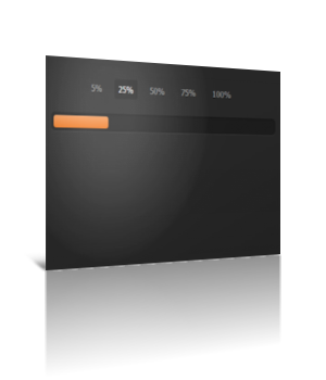 Достаточно интересный прогресс бар, выполненный на чистом css с возможностью переключать его на нужное количество процентов Для начала посмотрите ДЕМО Моё тестирование в фидле: КЛИК Установка: В самый низ вашего css вставляйте: Код /* * Copyright (c) 2012-2013 Thibaut Courouble * http://www.cssflow.com * Licensed under the MIT License * * Sass/SCSS source: http://goo.gl/UhXKg * PSD by Vin Thomas: http://goo.gl/n1M2e */ .container { margin: 60px auto; width: 400px; text-align: center; } .container .progress { margin: 0 auto; width: 400px; } .progress { padding: 4px; background: rgba(0, 0, 0, 0.25); border-radius: 6px; -webkit-box-shadow: inset 0 1px 2px rgba(0, 0, 0, 0.25), 0 1px rgba(255, 255, 255, 0.08); box-shadow: inset 0 1px 2px rgba(0, 0, 0, 0.25), 0 1px rgba(255, 255, 255, 0.08); } .progress-bar { height: 16px; border-radius: 4px; background-image: -webkit-linear-gradient(top, rgba(255, 255, 255, 0.3), rgba(255, 255, 255, 0.05)); background-image: -moz-linear-gradient(top, rgba(255, 255, 255, 0.3), rgba(255, 255, 255, 0.05)); background-image: -o-linear-gradient(top, rgba(255, 255, 255, 0.3), rgba(255, 255, 255, 0.05)); background-image: linear-gradient(to bottom, rgba(255, 255, 255, 0.3), rgba(255, 255, 255, 0.05)); -webkit-transition: 0.4s linear; -moz-transition: 0.4s linear; -o-transition: 0.4s linear; transition: 0.4s linear; -webkit-transition-property: width, background-color; -moz-transition-property: width, background-color; -o-transition-property: width, background-color; transition-property: width, background-color; -webkit-box-shadow: 0 0 1px 1px rgba(0, 0, 0, 0.25), inset 0 1px rgba(255, 255, 255, 0.1); box-shadow: 0 0 1px 1px rgba(0, 0, 0, 0.25), inset 0 1px rgba(255, 255, 255, 0.1); } /* * Note: using adjacent or general sibling selectors combined with * pseudo classes doesn't work in Safari 5.0 and Chrome 12. * See this article for more info and a potential fix: * http://css-tricks.com/webkit-sibling-bug/ */ #five:checked ~ .progress > .progress-bar { width: 5%; background-color: #f63a0f; } #twentyfive:checked ~ .progress > .progress-bar { width: 25%; background-color: #f27011; } #fifty:checked ~ .progress > .progress-bar { width: 50%; background-color: #f2b01e; } #seventyfive:checked ~ .progress > .progress-bar { width: 75%; background-color: #f2d31b; } #onehundred:checked ~ .progress > .progress-bar { width: 100%; background-color: #86e01e; } .radio { display: none; } .label { display: inline-block; margin: 0 5px 20px; padding: 3px 8px; color: #aaa; text-shadow: 0 1px black; border-radius: 3px; cursor: pointer; } .radio:checked + .label { color: white; background: rgba(0, 0, 0, 0.25); } В то место, где должен быть сам прогресс бар, вставляйте: Код <div class="container"> <input type="radio" class="radio" name="progress" value="five" id="five"> <label for="five" class="label">5%</label> <input type="radio" class="radio" name="progress" value="twentyfive" id="twentyfive" checked> <label for="twentyfive" class="label">25%</label> <input type="radio" class="radio" name="progress" value="fifty" id="fifty"> <label for="fifty" class="label">50%</label> <input type="radio" class="radio" name="progress" value="seventyfive" id="seventyfive"> <label for="seventyfive" class="label">75%</label> <input type="radio" class="radio" name="progress" value="onehundred" id="onehundred"> <label for="onehundred" class="label">100%</label> <div class="progress"> <div class="progress-bar"></div> </div> </div> Авторство указано в css участке кода Материал подготовлен Apocalypse | |
| Просмотров: 830 | Загрузок: 0 | Комментарии: 2 | | |
| Всего комментариев: 2 | |||
| |||