| Главная » Файлы » Прочие скрипты » CSS |
Стильное светлое горизонтальное меню на CSS3 для uCoz
| [ Скачать с сервера (0.8 Kb) ] | 06.10.14, 07:59:43 |
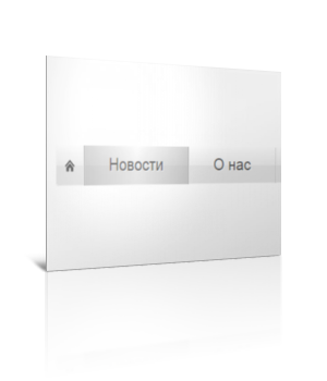 Очень даже симпотное светлое горизонтальное меню для вашего сайта на чистом css3 Для начала посмотрите ДЕМО Моё тестирование в фидле: КЛИК Установка: В самый низ вашего css вставляйте: Код .fancyNav{ /* Affects the UL element */ overflow: hidden; display: inline-block; width:700px; border-radius: 4px; -moz-border-radius: 4px; -webkit-border-radius: 4px; box-shadow: 0 0 4px rgba(255, 255, 255, 0.6); -moz-box-shadow: 0 0 4px rgba(255, 255, 255, 0.6); -webkit-box-shadow: 0 0 4px rgba(255, 255, 255, 0.6); } .fancyNav li{ /* Specifying a fallback color and we define CSS3 gradients for the major browsers: */ background-color: #f0f0f0; background-image: -webkit-gradient(linear,left top, left bottom,from(#fefefe), color-stop(0.5,#f0f0f0), color-stop(0.51, #e6e6e6)); background-image: -moz-linear-gradient(#fefefe 0%, #f0f0f0 50%, #e6e6e6 51%); background-image: -o-linear-gradient(#fefefe 0%, #f0f0f0 50%, #e6e6e6 51%); background-image: -ms-linear-gradient(#fefefe 0%, #f0f0f0 50%, #e6e6e6 51%); background-image: linear-gradient(#fefefe 0%, #f0f0f0 50%, #e6e6e6 51%); border-right: 1px solid rgba(9, 9, 9, 0.125); /* Adding a 1px inset highlight for a more polished efect: */ box-shadow: 1px -1px 0 rgba(255, 255, 255, 0.6) inset; -moz-box-shadow: 1px -1px 0 rgba(255, 255, 255, 0.6) inset; -webkit-box-shadow: 1px -1px 0 rgba(255, 255, 255, 0.6) inset; position:relative; float: left; list-style: none; } .fancyNav li:after{ /* This creates a pseudo element inslide each LI */ content:'.'; text-indent:-9999px; overflow:hidden; position:absolute; width:100%; height:100%; top:0; left:0; z-index:1; opacity:0; /* Gradients! */ background-image:-webkit-gradient(linear, left top, right top, from(rgba(168,168,168,0.5)),color-stop(0.5,rgba(168,168,168,0)), to(rgba(168,168,168,0.5))); background-image:-moz-linear-gradient(left, rgba(168,168,168,0.5), rgba(168,168,168,0) 50%, rgba(168,168,168,0.5)); background-image:-o-linear-gradient(left, rgba(168,168,168,0.5), rgba(168,168,168,0) 50%, rgba(168,168,168,0.5)); background-image:-ms-linear-gradient(left, rgba(168,168,168,0.5), rgba(168,168,168,0) 50%, rgba(168,168,168,0.5)); background-image:linear-gradient(left, rgba(168,168,168,0.5), rgba(168,168,168,0) 50%, rgba(168,168,168,0.5)); /* Creating borders with box-shadow. Useful, as they don't affect the size of the element. */ box-shadow:-1px 0 0 #a3a3a3,-2px 0 0 #fff,1px 0 0 #a3a3a3,2px 0 0 #fff; -moz-box-shadow:-1px 0 0 #a3a3a3,-2px 0 0 #fff,1px 0 0 #a3a3a3,2px 0 0 #fff; -webkit-box-shadow:-1px 0 0 #a3a3a3,-2px 0 0 #fff,1px 0 0 #a3a3a3,2px 0 0 #fff; /* This will create a smooth transition for the opacity property */ -moz-transition:0.25s all; -webkit-transition:0.25s all; -o-transition:0.25s all; transition:0.25s all; } /* Treating the first LI and li:after elements separately */ .fancyNav li:first-child{ border-radius: 4px 0 0 4px; } .fancyNav li:first-child:after, .fancyNav li.selected:first-child:after{ box-shadow:1px 0 0 #a3a3a3,2px 0 0 #fff; -moz-box-shadow:1px 0 0 #a3a3a3,2px 0 0 #fff; -webkit-box-shadow:1px 0 0 #a3a3a3,2px 0 0 #fff; border-radius:4px 0 0 4px; } .fancyNav li:last-child{ border-radius: 0 4px 4px 0; } /* Treating the last LI and li:after elements separately */ .fancyNav li:last-child:after, .fancyNav li.selected:last-child:after{ box-shadow:-1px 0 0 #a3a3a3,-2px 0 0 #fff; -moz-box-shadow:-1px 0 0 #a3a3a3,-2px 0 0 #fff; -webkit-box-shadow:-1px 0 0 #a3a3a3,-2px 0 0 #fff; border-radius:0 4px 4px 0; } .fancyNav li:hover:after, .fancyNav li.selected:after, .fancyNav li:target:after{ /* This property triggers the CSS3 transition */ opacity:1; } .fancyNav:hover li.selected:after, .fancyNav:hover li:target:after{ /* Hides the targeted li when we are hovering on the UL */ opacity:0; } .fancyNav li.selected:hover:after, .fancyNav li:target:hover:after{ opacity:1 !important; } /* Styling the anchor elements */ .fancyNav li a{ color: #5d5d5d; display: inline-block; font: 20px/1 Lobster,Arial,sans-serif; padding: 12px 35px 14px; position: relative; text-shadow: 1px 1px 0 rgba(255, 255, 255, 0.6); z-index:2; text-decoration:none !important; white-space:nowrap; } .fancyNav a.homeIcon{ background:url('/img/home.png') no-repeat center center; display: block; overflow: hidden; padding-left: 12px; padding-right: 12px; text-indent: -9999px; width: 16px; } nav{ display: block; margin: 300px auto 0; text-align: center; width: 650px; } В то место, где хотите видеть меню, вставляйте: Код <nav> <ul class="fancyNav"> <li id="home"><a href="#home" class="homeIcon">Главная</a></li> <li id="news"><a href="#news">Новости</a></li> <li id="about"><a href="#about">О нас</a></li> <li id="services"><a href="#services">Сервисы</a></li> <li id="contact"><a href="#contact">Контакты</a></li> </ul> </nav> Картинку из прикреплённого архива залейте в папку img Материал подготовлен Apocalypse | |
| Просмотров: 708 | Загрузок: 238 | | |
| Всего комментариев: 0 | |
|
| |