| Главная » Файлы » Прочие скрипты » CSS |
Стильное адаптивное меню на CSS3 для uCoz
| 24.06.14, 18:43:49 | |
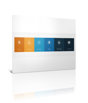 Замечательное яркое адаптивное меню для вашего сайта Для начала посмотрите ДЕМО Моё тестирование в фидле: КЛИК Установка: После < /head > на нужных страницах вставляйте: Код <script src="/js/modernizr.custom.js"></script> Следующий код в самый низ вашего css: Код @font-face { font-family:'icomoon'; src: url('/fonts/icomoon.eot'); src: url('/fonts/icomoon.eot?#iefix') format('embedded-opentype'), url('/fonts/icomoon.woff') format('woff'), url('/fonts/icomoon.ttf') format('truetype'), url('/fonts/icomoon.svg#icomoon') format('svg'); font-weight: normal; font-style: normal; } /* Windows Chrome ugly fix http://stackoverflow.com/questions/13674808/chrome-svg-font-rendering-breaks-layout/14345363#14345363 */ @media screen and (-webkit-min-device-pixel-ratio:0) { @font-face { font-family:'icomoon'; src: url('/fonts/icomoon.svg#icomoon') format('svg'); } ; } .icon-team, .icon-blog, .icon-home, .icon-portfolio, .icon-services, .icon-contact, .icon-menu { font-family:'icomoon'; speak: none; font-style: normal; font-weight: normal; font-variant: normal; text-transform: none; line-height: 1; -webkit-font-smoothing: antialiased; } .icon-team:before { content:"\e000"; } .icon-blog:before { content:"\e001"; } .icon-home:before { content:"\e002"; } .icon-portfolio:before { content:"\e003"; } .icon-services:before { content:"\e004"; } .icon-contact:before { content:"\e005"; } .icon-menu:before { content:"\f0c9"; } a, li { -webkit-tap-highlight-color: rgba(0, 0, 0, 0); } /* Global CSS that are applied for all screen sizes */ .nav ul { max-width: 1240px; margin: 0; padding: 0; list-style: none; font-size: 1.5em; font-weight: 300; } .nav li span { display: block; } .nav a { display: block; color: rgba(249, 249, 249, .9); text-decoration: none; -webkit-transition: color .5s, background .5s, height .5s; -moz-transition: color .5s, background .5s, height .5s; -o-transition: color .5s, background .5s, height .5s; -ms-transition: color .5s, background .5s, height .5s; transition: color .5s, background .5s, height .5s; } .nav i { /* Make the font smoother for Chrome */ -webkit-transform: translate3d(0, 0, 0); -moz-transform: translate3d(0, 0, 0); -o-transform: translate3d(0, 0, 0); -ms-transform: translate3d(0, 0, 0); transform: translate3d(0, 0, 0); } /* Remove the blue Webkit background when element is tapped */ a, button { -webkit-tap-highlight-color: rgba(0, 0, 0, 0); } /* Hover effect for the whole navigation to make the hovered item stand out */ .no-touch .nav ul:hover a { color: rgba(249, 249, 249, .5); } .no-touch .nav ul:hover a:hover { color: rgba(249, 249, 249, 0.99); } /* Adding some background color to the different menu items */ .nav li:nth-child(6n+1) { background: rgb(208, 101, 3); } .nav li:nth-child(6n+2) { background: rgb(233, 147, 26); } .nav li:nth-child(6n+3) { background: rgb(22, 145, 190); } .nav li:nth-child(6n+4) { background: rgb(22, 107, 162); } .nav li:nth-child(6n+5) { background: rgb(27, 54, 71); } .nav li:nth-child(6n+6) { background: rgb(21, 40, 54); } /* For screen bigger than 800px */ @media (min-width: 50em) { /* Transforms the list into a horizontal navigation */ .nav li { float: left; width: 16.66666666666667%; text-align: center; -webkit-transition: border .5s; -moz-transition: border .5s; -o-transition: border .5s; -ms-transition: border .5s; transition: border .5s; } .nav a { display: block; width: auto; } /* hover, focused and active effects that add a little colored border to the different items */ .no-touch .nav li:nth-child(6n+1) a:hover, .no-touch .nav li:nth-child(6n+1) a:active, .no-touch .nav li:nth-child(6n+1) a:focus { border-bottom: 4px solid rgb(174, 78, 1); } .no-touch .nav li:nth-child(6n+2) a:hover, .no-touch .nav li:nth-child(6n+2) a:active, .no-touch .nav li:nth-child(6n+2) a:focus { border-bottom: 4px solid rgb(191, 117, 20); } .no-touch .nav li:nth-child(6n+3) a:hover, .no-touch .nav li:nth-child(6n+3) a:active, .no-touch .nav li:nth-child(6n+3) a:focus { border-bottom: 4px solid rgb(12, 110, 149); } .no-touch .nav li:nth-child(6n+4) a:hover, .no-touch .nav li:nth-child(6n+4) a:active, .no-touch .nav li:nth-child(6n+4) a:focus { border-bottom: 4px solid rgb(10, 75, 117); } .no-touch .nav li:nth-child(6n+5) a:hover, .no-touch .nav li:nth-child(6n+5) a:active, .no-touch .nav li:nth-child(6n+5) a:focus { border-bottom: 4px solid rgb(16, 34, 44); } .no-touch .nav li:nth-child(6n+6) a:hover, .no-touch .nav li:nth-child(6n+6) a:active, .no-touch .nav li:nth-child(6n+6) a:focus { border-bottom: 4px solid rgb(9, 18, 25); } /* Placing the icon */ .icon { padding-top: 1.4em; } .icon + span { margin-top: 2.1em; -webkit-transition: margin .5s; -moz-transition: margin .5s; -o-transition: margin .5s; -ms-transition: margin .5s; transition: margin .5s; } /* Animating the height of the element*/ .nav a { height: 9em; } .no-touch .nav a:hover, .nav a:active, .nav a:focus { height: 10em; } /* Making the text follow the height animation */ .no-touch .nav a:hover .icon + span { margin-top: 3.2em; -webkit-transition: margin .5s; -moz-transition: margin .5s; -o-transition: margin .5s; -ms-transition: margin .5s; transition: margin .5s; } /* Positioning the icons and preparing for the animation*/ .nav i { position: relative; display: inline-block; margin: 0 auto; padding: 0.4em; border-radius: 50%; font-size: 1.8em; box-shadow: 0 0 0 30px transparent; background: rgba(255, 255, 255, 0.1); -webkit-transform: translate3d(0, 0, 0); -moz-transform: translate3d(0, 0, 0); -o-transform: translate3d(0, 0, 0); -ms-transform: translate3d(0, 0, 0); transform: translate3d(0, 0, 0); -webkit-transition: box-shadow .6s ease-in-out; -moz-transition: box-shadow .6s ease-in-out; -o-transition: box-shadow .6s ease-in-out; -ms-transition: box-shadow .6s ease-in-out; transition: box-shadow .6s ease-in-out; } /* Animate the box-shadow to create the effect */ .no-touch .nav a:hover i, .no-touch .nav a:active i, .no-touch .nav a:focus i { box-shadow: 0 0 0 0 rgba(255, 255, 255, 0.2); -webkit-transition: box-shadow .4s ease-in-out; -moz-transition: box-shadow .4s ease-in-out; -o-transition: box-shadow .4s ease-in-out; -ms-transition: box-shadow .4s ease-in-out; transition: box-shadow .4s ease-in-out; } } @media (min-width: 50em) and (max-width: 61.250em) { /* Size and font adjustments to make it fit into the screen*/ .nav ul { font-size: 1.2em; } } /* The "tablet" and "mobile" version */ @media (max-width: 49.938em) { /* Instead of adding a border, we transition the background color */ .no-touch .nav ul li:nth-child(6n+1) a:hover, .no-touch .nav ul li:nth-child(6n+1) a:active, .no-touch .nav ul li:nth-child(6n+1) a:focus { background: rgb(227, 119, 20); } .no-touch .nav li:nth-child(6n+2) a:hover, .no-touch .nav li:nth-child(6n+2) a:active, .no-touch .nav li:nth-child(6n+2) a:focus { background: rgb(245, 160, 41); } .no-touch .nav li:nth-child(6n+3) a:hover, .no-touch .nav li:nth-child(6n+3) a:active, .no-touch .nav li:nth-child(6n+3) a:focus { background: rgb(44, 168, 219); } .no-touch .nav li:nth-child(6n+4) a:hover, .no-touch .nav li:nth-child(6n+4) a:active, .no-touch .nav li:nth-child(6n+4) a:focus { background: rgb(31, 120, 176); } .no-touch .nav li:nth-child(6n+5) a:hover, .no-touch .nav li:nth-child(6n+5) a:active, .no-touch .nav li:nth-child(6n+5) a:focus { background: rgb(39, 70, 90); } .no-touch .nav li:nth-child(6n+6) a:hover, .no-touch .nav li:nth-child(6n+6) a:active, .no-touch .nav li:nth-child(6n+6) a:focus { background: rgb(32, 54, 68); } .nav ul li { -webkit-transition: background 0.5s; -moz-transition: background 0.5s; -o-transition: background 0.5s; -ms-transition: background 0.5s; transition: background 0.5s; } } /* CSS specific to the 2x3 columns version */ @media (min-width:32.5em) and (max-width: 49.938em) { /* Creating the 2 column layout using floating elements once again */ .nav li { display: block; float: left; width: 50%; } /* Adding some padding to make the elements look nicer*/ .nav a { padding: 0.8em; } /* Displaying the icons on the left, and the text on the right side using inlin-block*/ .nav li span, .nav li span.icon { display: inline-block; } .nav li span.icon { width: 50%; } .nav li .icon + span { font-size: 1em; } .icon + span { position: relative; top: -0.2em; } /* Adaptating to the icons to animate the size and border of the rounded background in a more discreet way */ .nav li i { display: inline-block; padding: 8% 9%; border: 4px solid transparent; border-radius: 50%; font-size: 1.5em; background: rgba(255, 255, 255, 0.1); -webkit-transition: border .5s; -moz-transition: border .5s; -o-transition: border .5s; -ms-transition: border .5s; transition: border .5s; } /* Transition effect on the border color */ .no-touch .nav li:hover i, .no-touch .nav li:active i, .no-touch .nav li:focus i { border: 4px solid rgba(255, 255, 255, 0.1); } } /* Adapting the font size and width for smaller screns*/ @media (min-width: 32.5em) and (max-width: 38.688em) { .nav li span.icon { width: 50%; } .nav li .icon + span { font-size: 0.9em; } } /* Styling the toggle menu link and hiding it */ .nav .navtoogle { display: none; width: 100%; padding: 0.5em 0.5em 0.8em; font-family:'Lato', Calibri, Arial, sans-serif; font-weight: normal; text-align: left; color: rgb(7, 16, 15); font-size: 1.2em; background: none; border: none; border-bottom: 4px solid rgb(221, 221, 221); cursor: pointer; } .navtoogle i { z-index:-1; } .icon-menu { position: relative; top: 3px; line-height: 0; font-size: 1.6em; } @media (max-width: 32.438em) { /* Unhiding the styled menu link */ .nav .navtoogle { margin: 0; display: block; } /* Animating the height of the navigation when the button is clicked */ /* When JavaScript is disabled, we hide the menu */ .no-js .nav ul { max-height: 30em; overflow: hidden; } /* When JavaScript is enabled, we hide the menu */ .js .nav ul { max-height: 0em; overflow: hidden; } /* Displaying the menu when the user has clicked on the button*/ .js .nav .active + ul { max-height: 30em; overflow: hidden; -webkit-transition: max-height .4s; -moz-transition: max-height .4s; -o-transition: max-height .4s; -ms-transition: max-height .4s; transition: max-height .4s; } /* Adapting the layout of the menu for smaller screens : icon on the left and text on the right*/ .nav li span { display: inline-block; height: 100%; } .nav a { padding: 0.5em; } .icon + span { margin-left: 1em; font-size: 0.8em; } /* Adding a left border of 8 px with a different color for each menu item*/ .nav li:nth-child(6n+1) { border-left: 8px solid rgb(174, 78, 1); } .nav li:nth-child(6n+2) { border-left: 8px solid rgb(191, 117, 20); } .nav li:nth-child(6n+3) { border-left: 8px solid rgb(13, 111, 150); } .nav li:nth-child(6n+4) { border-left: 8px solid rgb(10, 75, 117); } .nav li:nth-child(6n+5) { border-left: 8px solid rgb(16, 34, 44); } .nav li:nth-child(6n+6) { border-left: 8px solid rgb(9, 18, 25); } /* make the nav bigger on touch screens */ .touch .nav a { padding: 0.8em; } } Следующий код в то место, где должно быть само меню: Код <div class="main clearfix"> <nav id="menu" class="nav"> <ul> <li> <a href="#"> <span class="icon"> <i aria-hidden="true" class="icon-home"></i> </span> <span>Home</span> </a> </li> <li> <a href="#"> <span class="icon"> <i aria-hidden="true" class="icon-services"></i> </span> <span>Services</span> </a> </li> <li> <a href="#"> <span class="icon"> <i aria-hidden="true" class="icon-portfolio"></i> </span> <span>Portfolio</span> </a> </li> <li> <a href="#"> <span class="icon"> <i aria-hidden="true" class="icon-blog"></i> </span> <span>Blog</span> </a> </li> <li> <a href="#"> <span class="icon"> <i aria-hidden="true" class="icon-team"></i> </span> <span>The team</span> </a> </li> <li> <a href="#"> <span class="icon"> <i aria-hidden="true" class="icon-contact"></i> </span> <span>Contact</span> </a> </li> </ul> </nav> </div> Файлы шрифтов нужны, чтобы отображать иконки в меню Материал подготовлен Apocalypse | |
| Просмотров: 771 | Загрузок: 0 | | |
| Всего комментариев: 0 | |
|
| |