| Главная » Файлы » Прочие скрипты » CSS |
Ротатор текста на CSS3 с интересными эффектами для uCoz
| 24.06.14, 18:48:55 | |
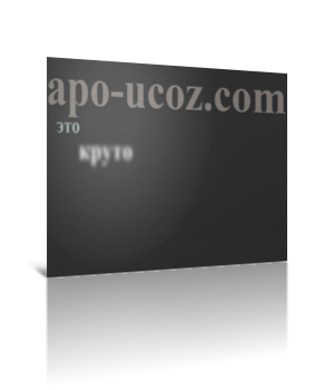 Оригинальное решение. Если честно, я пока что такого ещё не встречал на чистом css и просто не мог не оформить материал для пользователей этого сайта Для начала посмотрите ДЕМО Моё тестирование в фидле: КЛИК Установка: В самый низ вашего css вставляйте: Код .rw-wrapper { width: 500px; height:500px; position: relative; margin: 0px auto 0 auto; padding: 10px; background:#333 } .rw-sentence { margin: 0; } .rw-sentence span { text-align: center; color: rgba(255, 255, 255, 1); font-family:'Trocchi'; white-space: nowrap; text-shadow: 2px 5px 10px rgba(0, 0, 0, 0.1); } .rw-sentence > span { position: absolute; } .rw-sentence > span:first-child { top: 0px; left: 140px; font-size: 700%; color: rgba(187, 177, 168, 0.6); } .rw-sentence > span:nth-child(2) { top: 160px; left: 300px; font-size: 315%; color: rgba(191, 218, 206, 0.7); } .rw-sentence > span:nth-child(3) { top: 185px; left: 65px; font-size: 600%; color: rgba(255, 255, 255, 0.8); } .rw-sentence > span:last-child { top: 435px; left: 550px; font-size: 200%; color: rgba(237, 234, 168, 0.9); } .rw-words { position: absolute; left: 220px; top: 220px; height: 80px; width: 400px; -webkit-perspective: 800px; -moz-perspective: 800px; -o-perspective: 800px; -ms-perspective: 800px; perspective: 800px; } .rw-words span { position: absolute; font-size: 800%; color: transparent; text-shadow: 0px 0px 80px rgba(255, 255, 255, 1); opacity: 0; -webkit-animation: rotateWord 18s linear infinite 0s; -moz-animation: rotateWord 18s linear infinite 0s; -o-animation: rotateWord 18s linear infinite 0s; -ms-animation: rotateWord 18s linear infinite 0s; animation: rotateWord 18s linear infinite 0s; } .rw-words span:nth-child(2) { -webkit-animation-delay: 3s; -moz-animation-delay: 3s; -o-animation-delay: 3s; -ms-animation-delay: 3s; animation-delay: 3s; } .rw-words span:nth-child(3) { -webkit-animation-delay: 6s; -moz-animation-delay: 6s; -o-animation-delay: 6s; -ms-animation-delay: 6s; animation-delay: 6s; } .rw-words span:nth-child(4) { -webkit-animation-delay: 9s; -moz-animation-delay: 9s; -o-animation-delay: 9s; -ms-animation-delay: 9s; animation-delay: 9s; } .rw-words span:nth-child(5) { -webkit-animation-delay: 12s; -moz-animation-delay: 12s; -o-animation-delay: 12s; -ms-animation-delay: 12s; animation-delay: 12s; } .rw-words span:nth-child(6) { -webkit-animation-delay: 15s; -moz-animation-delay: 15s; -o-animation-delay: 15s; -ms-animation-delay: 15s; animation-delay: 15s; } @-webkit-keyframes rotateWord { 0% { opacity: 0; -webkit-animation-timing-function: ease-in; -webkit-transform: translateY(-200px) translateZ(300px) rotateY(-120deg); } 5% { opacity: 1; -webkit-animation-timing-function: ease-out; -webkit-transform: translateY(0px) translateZ(0px) rotateY(0deg); } 6% { text-shadow: 0px 0px 0px rgba(255, 255, 255, 1); color #fff; } 17% { opacity: 1; text-shadow: 0px 0px 0px rgba(255, 255, 255, 1); color #fff; } 20% { opacity: 0; } 100% { opacity: 0; } } @-moz-keyframes rotateWord { 0% { opacity: 0; -moz-animation-timing-function: ease-in; -moz-transform: translateY(-200px) translateZ(300px) rotateY(-120deg); } 5% { opacity: 1; -moz-animation-timing-function: ease-out; -moz-transform: translateY(0px) translateZ(0px) rotateY(0deg); } 6% { text-shadow: 0px 0px 0px rgba(255, 255, 255, 1); color #fff; } 17% { opacity: 1; text-shadow: 0px 0px 0px rgba(255, 255, 255, 1); color #fff; } 20% { opacity: 0; } 100% { opacity: 0; } } @-o-keyframes rotateWord { 0% { opacity: 0; -o-animation-timing-function: ease-in; -o-transform: translateY(-200px) translateZ(300px) rotateY(-120deg); } 5% { opacity: 1; -o-animation-timing-function: ease-out; -o-transform: translateY(0px) translateZ(0px) rotateY(0deg); } 6% { text-shadow: 0px 0px 0px rgba(255, 255, 255, 1); color #fff; } 17% { opacity: 1; text-shadow: 0px 0px 0px rgba(255, 255, 255, 1); color #fff; } 20% { opacity: 0; } 100% { opacity: 0; } } @-ms-keyframes rotateWord { 0% { opacity: 0; -ms-animation-timing-function: ease-in; -ms-transform: translateY(-200px) translateZ(300px) rotateY(-120deg); } 5% { opacity: 1; -ms-animation-timing-function: ease-out; -ms-transform: translateY(0px) translateZ(0px) rotateY(0deg); } 6% { text-shadow: 0px 0px 0px rgba(255, 255, 255, 1); color #fff; } 17% { opacity: 1; text-shadow: 0px 0px 0px rgba(255, 255, 255, 1); color #fff; } 20% { opacity: 0; } 100% { opacity: 0; } } @keyframes rotateWord { 0% { opacity: 0; animation-timing-function: ease-in; transform: translateY(-200px) translateZ(300px) rotateY(-120deg); } 5% { opacity: 1; animation-timing-function: ease-out; transform: translateY(0px) translateZ(0px) rotateY(0deg); } 6% { text-shadow: 0px 0px 0px rgba(255, 255, 255, 1); color #fff; } 17% { opacity: 1; text-shadow: 0px 0px 0px rgba(255, 255, 255, 1); color #fff; } 20% { opacity: 0; } 100% { opacity: 0; } } @media screen and (max-width: 1060px) { .rw-sentence > span:first-child { font-size: 500%; left: 0px; } .rw-sentence > span:nth-child(2) { font-size: 200%; top: 125px; left: 30px; } .rw-sentence > span:nth-child(3) { top: 175px; left: 30px; font-size: 235%; } .rw-words { left: 95px; top: 171px; } .rw-words span { font-size: 250%; } .rw-sentence > span:last-child { top: 240px; left: 30px; } } @media screen and (max-width: 400px) { .rw-sentence > span:first-child { font-size: 200%; left: 0px; } .rw-sentence > span:nth-child(2) { font-size: 100%; top: 50px; left: 10px; } .rw-sentence > span:nth-child(3) { top: 76px; left: 10px; font-size: 120%; } .rw-words { left: 45px; top: 76px; } .rw-words span { font-size: 120%; } .rw-sentence > span:last-child { top: 106px; left: 10px; font-size: 100%; } } Следующий код в то место, где нужен текст с ротацией: Код <section class="rw-wrapper"> <h2 class="rw-sentence"> <span>apo-ucoz.com</span> <span>это</span> <div class="rw-words"> <span>круто</span> <span>модно</span> <span>стильно</span> <span>скриптовзрывательно</span> <span>мозгодробительно</span> <span>бубликолюбительно</span> </div> </h2> </section> Материал подготовлен Apocalypse | |
| Просмотров: 546 | Загрузок: 0 | | |
| Всего комментариев: 0 | |
|
| |