| Главная » Файлы » Прочие скрипты » CSS |
Очень оригинальное круглое меню на чистом CSS3 для uCoz
| 24.06.14, 16:53:04 | |
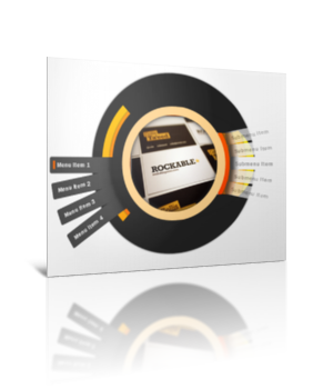 Я очень сильно удивился, когда узнал, что это меню не использует ни одного скрипта или картинки. Приятно радует, что автор данного кода смог проявить фантазию и реализовать данное чудо на чистом CSS3 Для начала посмотрите ДЕМО Вот моё тестирование в фидле: КЛИК Установка: В самый низ вашего css вставляйте: Код a { text-decoration:none; outline:none; /* For keeping links clear of underlines or other decorations */ } #menu-wrap { /* Use this to move the navigator around on your page wherever you want so not to break it by changing other styles */ background:none; /* This isn't needed */ height:600px; /* This is important and keeps the navigation in place when hovering over elements in google chrome */ font-family:Franklin Gothic Medium, Helvetica, Arial, sans-serif; /* If not using Franklin, it will automatically go to the next font in the family */ font-size:13px; /* Establishes the global font size */ letter-spacing: 1px !important; /* Effects spacing between letters for all fonts in the wheel */ } #menu-wrap .orbit { height: 210px; margin: 32px; /* Pushes the images in the display to the center */ position: absolute; width: 210px; } #menu-wrap .orbit-frame { border:2px solid #999; /* Creates a division between the image and wrap5 */ } /** menu links **/ /** tester **/ ul.menuBuild, ul.menuBuild ul { width: 80px; /* sets the size of the menu blocks */ background: rgb(0, 0, 0); /* RGBa with 0.6 opacity */ background: rgba(0, 0, 0, 0.01); /* makes the menu blocks mint green - a bg-color MUST be included for IE to work properly! */ padding-left: 0px; /* stops the usual indent from ul */ margin-left: 76px; /* Opera 7 final's margin and margin-box model cause problems */ } ul.menuBuild li { list-style-type: none; /* removes the bullet points */ position: relative; -webkit-border-radius: 4px 0 0 4px; /* webkit browsers */ -moz-border-radius: 4px 0 0 4px; /* firefox */ border-radius: 4px 0 0 4px; /* opera */ background: none repeat scroll 0 0 #464646; /* Solid background for older browsers to fall back on */ height: 14px; left: -177px; padding: 8px; margin: 6px 0 0; width:140px; text-indent:5px; /* How far the text is from the left edge of the menu */ color: #fff; /* sets the default font colour to white */ } ul.menuBuild ul.submenu li { background: #f2f2f2; /* old browsers */ background: -moz-linear-gradient(left, #565656 0%, #666 3%, #FFF 14%); /* firefox */ background: -webkit-gradient(linear, left top, right top, color-stop(0%, #565656), color-stop(3%, #666), color-stop(14%, #FFF)); /* webkit */ background: linear-gradient(left, #565656 0%, #666 3%, #FFF 14%); /*future CSS3 browsers*/ -pie-background: linear-gradient(left, #565656 0%, #666 3%, #FFF 14%); /*PIE*/ /*filter: progid:DXImageTransform.Microsoft.gradient( startColorstr='#e7e7e7', endColorstr='#FFF',GradientType=1 );*/ /* ie */ color:#464646; position:relative; left:344px; /* This is how the menu ends up on the other side of the wheel */ -webkit-box-shadow: -2px 3px 12px -7px #161616; /* webkit browsers */ box-shadow: 16px 0 10px -8px #464646 inset; /* opera */ -moz-box-shadow: -2px 3px 12px -7px #161616; /* firefox */ } ul.menuBuild ul.submenu li.first { -webkit-transform:rotate(-12deg); /* webkit browsers */ -moz-transform:rotate(-12deg); /* firefox */ -o-transform:rotate(-12deg); /* opera */ -ms-transform: rotate(-12deg); /* for IE9 and future versions */ transform: rotate(-12deg); /* For older broswers */ margin-left: -12px; opacity: 0.70; } ul.menuBuild ul.submenu li.second { -webkit-transform:rotate(-6deg); /* webkit browsers */ -moz-transform:rotate(-6deg); /* firefox */ -o-transform:rotate(-6deg); /* opera */ -ms-transform: rotate(-6deg); /* for IE9 and future versions */ transform: rotate(-6deg); /* For older broswers */ margin-left:-3px; opacity: 0.85; } ul.menuBuild ul.submenu li.third { -webkit-transform:rotate(6deg); /* webkit browsers */ -moz-transform:rotate(6deg); /* firefox */ -o-transform:rotate(6deg); /* opera */ -ms-transform: rotate(6deg); /* for IE9 and future versions */ transform: rotate(6deg); /* For older broswers */ margin-left:-3px; opacity: 0.85; } ul.menuBuild ul.submenu li.last { -webkit-transform:rotate(12deg); /* webkit browsers */ -moz-transform:rotate(12deg); /* firefox */ -o-transform:rotate(12deg); /* opera */ -ms-transform: rotate(12deg); /* for IE9 and future versions */ transform: rotate(12deg); /* For older broswers */ margin-left:-12px; opacity: 0.70; } ul.menuBuild li > ul { /* using the > selector prevents many lesser browsers (and IE - see below) hiding child ULs */ display: none; /* make child blocks hover without leaving space for them */ top: -48px; position: absolute; right: -86px; color:#565656; width: 160px; -webkit-border-radius: 0 4px 4px 0; /* webkit */ -moz-border-radius: 0 4px 4px 0; /* firefox */ border-radius: 0 4px 4px 0; /* opera */ padding: 2px; height: 24px; background: rgb(255, 255, 255); /* Fallback for web browsers that don't support RGBa */ background: rgba(255, 255, 255, 0.00); /* RGBa with 0.01 opacity */ } /**ul.menuBuild li span{display:none;} ul.menuBuild li:hover span{display:block;}**/ ul.menuBuild li#menu1, ul.menuBuild li#menu2, ul.menuBuild li#menu3, ul.menuBuild li#menu4 { -webkit-border-radius: 4px 0 0 4px; /* webkit */ -moz-border-radius: 4px 0 0 4px; /* firefox */ border-radius: 4px 0 0 4px; /* opera */ -webkit-box-shadow:-2px 7px 8px -7px #161616; /* webkit */ -moz-box-shadow:-2px 7px 8px -7px #161616; /* firefox */ box-shadow:-16px 0 8px -7px #222222 inset; /* opera */ background: #464646; /* old browsers */ background: -moz-linear-gradient(left, #464646 78%, #363636 97%, #222222 100%); /* firefox */ background: -webkit-gradient(linear, left top, right top, color-stop(78%, #464646), color-stop(97%, #363636), color-stop(100%, #222222)); /* webkit */ background: linear-gradient(left, #464646 78%, #363636 97%, #222222 100%); /*future CSS3 browsers*/ -pie-background: linear-gradient(left, #464646 78%, #363636 97%, #222222 100%); /*IE fix using Pie*/ filter: progid:DXImageTransform.Microsoft.gradient(startColorstr='#464646', endColorstr='#222222', GradientType=1); /* ie */ height: 18px; padding: 8px; position: absolute; margin-top:100px; width:138px; } ul.menuBuild li#menu2 { -webkit-transform:rotate(-10deg); /* webkit */ -moz-transform:rotate(-10deg); /* firefox */ -o-transform:rotate(-10deg); /* opera */ -ms-transform: rotate(-10deg); /* ie9 and future versions */ transform: rotate(-10deg); /* older browsers */ margin-top: 141px; margin-left:5px; } ul.menuBuild li#menu3 { -webkit-transform:rotate(-21deg); /* webkit */ -moz-transform:rotate(-21deg); /* firefox */ -o-transform:rotate(-21deg); /* opera */ -ms-transform: rotate(-21deg); /* ie9 and future versions */ transform: rotate(-21deg); /* older browsers */ margin-top: 181px; margin-left:18px; } ul.menuBuild li#menu4 { -moz-transform: rotate(-32deg); /* firefox */ -ms-transform: rotate(-32deg); /* ie9 and future versions */ transform: rotate(-32deg); /* older browsers */ -webkit-transform: rotate(-32deg); /* webkit */ -o-transform: rotate(-32deg); /* opera */ margin-top: 218px; margin-left:38px; } /*********************************** Here's some support for the sub-menus ************************************/ ul.menuBuild li#menu1 > ul { margin-top:-35px; left:19px; } ul.menuBuild li#menu2 > ul { -webkit-transform:rotate(10deg); /* webkit */ -moz-transform:rotate(10deg); /* firefox */ -o-transform:rotate(10deg); /* opera */ -ms-transform: rotate(-10deg); /* ie9 and future versions */ transform: rotate(-10deg); /* older browsers */ left: 18px; margin-top: -38px; } ul.menuBuild li#menu3 > ul { -webkit-transform:rotate(21deg); /* webkit */ -moz-transform:rotate(21deg); /* firefox */ -o-transform:rotate(21deg); /* opera */ -ms-transform: rotate(-21deg); /* ie9 and future versions */ transform: rotate(-21deg); /* older browsers */ left: 16px; margin-top: -39px; } ul.menuBuild li#menu4 > ul { -webkit-transform:rotate(32deg); /* webkit */ -moz-transform:rotate(32deg); /* firefox */ -o-transform:rotate(32deg); /* opera */ -ms-transform: rotate(32deg); /* ie9 and future versions */ transform: rotate(32deg); /* older browsers */ left: 15px; margin-top: -40px; } ul.menuBuild li:hover > ul { /* one of the most important declarations - the browser must detect hovering over arbitrary elements, the > targets only the child ul, not any child uls of that child ul */ display: block; /* makes the child block visible - one of the most important declarations */ position:absolute; left:0; width:400px; height:200px; } /********************************************************** and some link styles *********************************************************/ ul.menuBuild ul.submenu li a { color:#464646; /* the color of submenu fonts */ opacity:0.65; /* This blends the font in with the background */ filter:alpha(opacity=65); } ul.menuBuild ul.submenu li a:hover { opacity:1.0; /* and this brings the font opacity back to 100% */ filter:alpha(opacity=100) } ul.menuBuild li a { /* for the main menu links */ color: #fff; display: block; width: 100%; } ul.menuBuild li:hover > a { color: #fff; border-left:solid 5px #ff6600; /* the indicator for when an item is hovered over */ } /* do not use display: block; */ .sub1, .sub2, .sub3, .sub4 { /* You can use this to individually style your sub-menu items */ } /****************************************************** Now we get to the containers ******************************************************/ .wrap1, .wrap2, .wrap3, .wrap4, .wrap5, .nav-holder { /* styles all of the wheel containers */ -moz-border-radius: 220px; /* firefox */ -webkit-border-radius: 220px; /* webkit */ border-radius: 220px; /* opera */ -moz-box-shadow: 0 0 5px 0 #262626; /* firefox */ -webkit-box-shadow: 0 0 5px 0 #262626; /* webkit */ box-shadow: 0 0 5px 0 #262626; /* opera */ margin:0 auto; position:relative !important; /* Do not touch unless you know what you are doing */ top:20px; } .nav-holder { -moz-box-shadow: none; /* Sharpens the wheel */ } .wrap1 { background: #FFFF00; /* old browsers */ background: -moz-linear-gradient(top, #FFFF00 0%, #FFCC00 100%); /* firefox */ background: -webkit-gradient(linear, left top, left bottom, color-stop(0%, #FFFF00), color-stop(100%, #FFCC00)); /* webkit */ background: linear-gradient(top, #FFFF00 0%, #FFCC00 100%); /*future CSS3 browsers*/ -pie-background: linear-gradient(top, #FFFF00 0%, #FFCC00 100%); /*IE fix using Pie*/ filter: progid:DXImageTransform.Microsoft.gradient(startColorstr='#FFFF00', endColorstr='#FFCC00', GradientType=0); /* ie */ height:394px; width:394px; } .wrap2 { background: #FFCC00; /* old browsers */ background: -moz-linear-gradient(top, #FFCC00 0%, #FF9900 100%); /* firefox */ background: -webkit-gradient(linear, left top, left bottom, color-stop(0%, #FFCC00), color-stop(100%, #FF9900)); /* webkit */ background: linear-gradient(top, #FFCC00 0%, #FF9900 100%); /*future CSS3 browsers*/ -pie-background: linear-gradient(top, #FFCC00 0%, #FF9900 100%); /*IE fix using Pie*/ filter: progid:DXImageTransform.Microsoft.gradient(startColorstr='#FFCC00', endColorstr='#FF9900', GradientType=0); /* ie */ height:354px; width:354px; } .wrap3 { background: #FF9900; /* old browsers */ background: -moz-linear-gradient(top, #FF9900 0%, #FF6600 100%); /* firefox */ background: -webkit-gradient(linear, left top, left bottom, color-stop(0%, #FF9900), color-stop(100%, #FF6600)); /* webkit */ background: linear-gradient(top, #FF9900 0%, #FF6600 100%); /*future CSS3 browsers*/ -pie-background: linear-gradient(top, #FF9900 0%, #FF6600 100%); /*IE fix using Pie*/ filter: progid:DXImageTransform.Microsoft.gradient(startColorstr='#FF9900', endColorstr='#FF6600', GradientType=0); /* ie */ height:314px; width:314px; } .wrap4 { background: #FF6600; /* old browsers */ background: -moz-linear-gradient(top, #FF6600 0%, #FF3300 100%); /* firefox */ background: -webkit-gradient(linear, left top, left bottom, color-stop(0%, #FF6600), color-stop(100%, #FF3300)); /* webkit */ background: linear-gradient(top, #FF6600 0%, #FF3300 100%); /*future CSS3 browsers*/ -pie-background: linear-gradient(top, #FF6600 0%, #FF3300 100%); /*IE fix using Pie*/ filter: progid:DXImageTransform.Microsoft.gradient(startColorstr='#FF6600', endColorstr='#FF3300', GradientType=0); /* ie */ -moz-box-shadow: 0 0 15px 2px #262626; -webkit-box-shadow: 0 0 15px 2px #262626; box-shadow: 0 0 15px 2px #262626; height:274px; width:274px; } .wrap5 { -moz-box-shadow: 0 0 15px 5px #262626 inset; /* firefox */ -webkit-box-shadow: 0 0 15px 5px #262626 inset; /* webkit */ box-shadow: 0 0 15px 1px #262626 inset; /* opera */ border: 20px solid #FFD48E; /* creates the wrap to see the image behind it */ height: 214px; top: 10px; /* center the element */ width: 214px; } .nav-holder { background: none repeat scroll 0 0 transparent; border-color: #222; /*** The border declarations are used to create the final wrapper, middle see through and hides the right border to show the submenus */ border-style: solid hidden solid double; border-width: 73px medium 73px 73px; height: 252px; margin: -92px; /* center the object on relative elements */ top: 0; width: 324px; } .completer, .completer2 { /** absolute elements to hide the border of images **/ -moz-border-radius: 0 120px 0 113px; /* firefox */ -webkit-border-radius: 0 120px 0 113px; /* webkit */ border-radius: 0 120px 0 113px; /* opera */ -moz-transform: rotate(-20deg); /* firefox */ -webkit-transform: rotate(-21deg); /* webkit */ -o-transform: rotate(-20deg); /* opera */ -ms-transform: rotate(-20deg); /* ie9 and future versions */ transform: rotate(-20deg); /* older browsers */ background-attachment: scroll; background-color: #222222; background-image: none; background-position: 0 0; background-repeat: repeat; height: 131px; position: absolute; right: -21px; top: -50px; width: 130px; } .completer2 { -moz-transform: rotate(108deg); /* firefox */ -webkit-transform: rotate(109deg); /* webkit */ -o-transform: rotate(108deg); /* opera */ -ms-transform: rotate(108deg); /* ie9 and future versions */ transform: rotate(108deg); /* older browsers */ top: 194px; } Следующий код в то место, где должно быть меню: Код <div id="menu-wrap"> <div class="wrap1"> <div class="wrap2"> <div class="wrap3"> <div class="wrap4"> <span class="img1"><img class="orbit orbit-frame" src="Ссылка на картинку, что будет в центре круга" alt="card08" /></span> <div class="completer"></div> <div class="completer2"></div> <div class="wrap5"> <div class="nav-holder"> <!-- start menu !--> <ul class="menuBuild"> <li id="menu1"><a href="#">Пункт 1</a> <ul class="submenu sub1"> <li class="first"><a href="#">Пункт подменю</a> </li> <li class="second"><a href="#">Пункт подменю</a> </li> <li><a href="#">Пункт подменю</a> </li> <li class="third"><a href="#">Пункт подменю</a> </li> <li class="last"><a href="#">Пункт подменю</a> </li> </ul> </li> <li id="menu2"><a href="#">Пункт 2</a> <ul class="submenu sub2"> <li class="first"><a href="#">Пункт подменю</a> </li> <li class="second"><a href="#">Пункт подменю</a> </li> </ul> </li> <li id="menu3"><a href="#">Пункт 3</a> <ul class="submenu sub3"> <li class="first"><a href="#">Пункт подменю</a> </li> <li class="second"><a href="#">Пункт подменю</a> </li> <li><a href="#">Пункт подменю</a> </li> </ul> </li> <li id="menu4"><a href="#">Пункт 4</a> <ul class="submenu sub4"> <li class="first"><a href="#">Пункт подменю</a> </li> <li class="second"><a href="#">Пункт подменю</a> </li> <li><a href="#">Пункт подменю</a> </li> </ul> </li> </ul> </div> </div> </div> </div> </div> </div> </div> Материал подготовлен Apocalypse | |
| Просмотров: 652 | Загрузок: 0 | | |
| Всего комментариев: 0 | |
|
| |