| Главная » Файлы » Прочие скрипты » CSS |
Эффект размытия на CSS3 для вашего сайта на uCoz
| 24.06.14, 18:47:32 | |
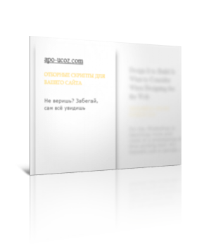 Я уже встречал подобное решение раньше, но оно работало только на вебкит браузерах. Данное решение сработало на всех браузерах, которые установлены у меня на данный момент Для начала посмотрите ДЕМО Моё тестирование в фидле: КЛИК Установка: В самый низ вашего css вставляйте: Код .ib-container h3 { margin:0; padding:0; font-size:100%; font-weight:normal; } .ib-container { position: relative; width: 800px; margin: 30px auto; display: block; } .ib-container:before, .ib-container:after { content:""; display:table; } .ib-container:after { clear:both; } .ib-container article { display: block; width: 140px; height: 220px; background: #fff; cursor: pointer; float: left; border: 10px solid #fff; text-align: left; text-transform: none; margin: 15px; -webkit-backface-visibility: hidden; z-index: 1; box-shadow: 0px 0px 0px 10px rgba(255, 255, 255, 1), 1px 1px 3px 10px rgba(0, 0, 0, 0.2); -webkit-transition: opacity 0.4s linear, -webkit-transform 0.4s ease-in-out, box-shadow 0.4s ease-in-out; -moz-transition: opacity 0.4s linear, -moz-transform 0.4s ease-in-out, box-shadow 0.4s ease-in-out; -o-transition: opacity 0.4s linear, -o-transform 0.4s ease-in-out, box-shadow 0.4s ease-in-out; -ms-transition: opacity 0.4s linear, -ms-transform 0.4s ease-in-out, box-shadow 0.4s ease-in-out; transition: opacity 0.4s linear, transform 0.4s ease-in-out, box-shadow 0.4s ease-in-out; } .ib-container h3 a { font-size: 16px; font-weight: 400; color: #000; color: rgba(0, 0, 0, 1); text-shadow: 0px 0px 0px rgba(0, 0, 0, 1); opacity: 0.8; } .ib-container article header span { font-size: 10px; font-family:"Big Caslon", "Book Antiqua", "Palatino Linotype", Georgia, serif; padding: 10px 0; display: block; color: #FFD252; color: rgba(255, 210, 82, 1); text-shadow: 0px 0px 0px rgba(255, 210, 82, 1); text-transform: uppercase; opacity: 0.8; } .ib-container article p { font-family: Verdana, sans-serif; font-size: 10px; line-height: 13px; color: #333; color: rgba(51, 51, 51, 1); text-shadow: 0px 0px 0px rgba(51, 51, 51, 1); opacity: 0.8; } .ib-container h3 a, .ib-container article header span, .ib-container article p { -webkit-transition: opacity 0.2s linear, text-shadow 0.5s ease-in-out, color 0.5s ease-in-out; -moz-transition: opacity 0.2s linear, text-shadow 0.5s ease-in-out, color 0.5s ease-in-out; -o-transition: opacity 0.2s linear, text-shadow 0.5s ease-in-out, color 0.5s ease-in-out; -ms-transition: opacity 0.2s linear, text-shadow 0.5s ease-in-out, color 0.5s ease-in-out; transition: opacity 0.2s linear, text-shadow 0.5s ease-in-out, color 0.5s ease-in-out; } /* Hover Style for all the items: blur, scale down*/ .ib-container article.blur { box-shadow: 0px 0px 20px 10px rgba(255, 255, 255, 1); -webkit-transform: scale(0.9); -moz-transform: scale(0.9); -o-transform: scale(0.9); -ms-transform: scale(0.9); transform: scale(0.9); opacity: 0.7; } .ib-container article.blur h3 a { text-shadow: 0px 0px 10px rgba(0, 0, 0, 0.9); color: rgba(0, 0, 0, 0); opacity: 0.5; } .ib-container article.blur header span { text-shadow: 0px 0px 10px rgba(255, 210, 82, 0.9); color: rgba(255, 210, 82, 0); opacity: 0.5; } .ib-container article.blur p { text-shadow: 0px 0px 10px rgba(51, 51, 51, 0.9); color: rgba(51, 51, 51, 0); opacity: 0.5; } /* Hover Style for single item: scale up */ .ib-container article.active { -webkit-transform: scale(1.05); -moz-transform: scale(1.05); -o-transform: scale(1.05); -ms-transform: scale(1.05); transform: scale(1.05); box-shadow: 0px 0px 0px 10px rgba(255, 255, 255, 1), 1px 11px 15px 10px rgba(0, 0, 0, 0.4); z-index: 100; opacity: 1; } .ib-container article.active h3 a, .ib-container article.active header span, .ib-container article.active p { opacity; 1; } В самый низ страницы перед < /body >: Код $(function () { var $container = $('#ib-container'), $articles = $container.children('article'), timeout; $articles.on('mouseenter', function (event) { var $article = $(this); clearTimeout(timeout); timeout = setTimeout(function () { if ($article.hasClass('active')) return false; $articles.not($article.removeClass('blur').addClass('active')) .removeClass('active') .addClass('blur'); }, 65); }); $container.on('mouseleave', function (event) { clearTimeout(timeout); $articles.removeClass('active blur'); }); }); Блоки оформляются следующим образом: Код <section class="ib-container" id="ib-container"> <article> <header> <h3> <a target="_blank" href="#">Ссылка в заголовке</a> </h3> <span>Текст заголовка</span> </header> Описание блока</p> </article> <article> <header> <h3> <a target="_blank" href="#">Ссылка в заголовке 2</a> </h3> <span>Текст заголовка 2</span> </header> Описание блока 2</p> </article> </section> Материал подготовлен Apocalypse | |
| Просмотров: 510 | Загрузок: 0 | | |
| Всего комментариев: 0 | |
|
| |