| Главная » Файлы » Прочие скрипты » CSS |
Анимированные индикаторы загрузки на чистом CSS3 для uCoz
| 24.06.14, 18:45:03 | |
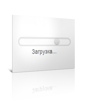 Классные индикаторы загрузки на чистом css. Если честно, не перестаю удивляться, сколько всего интересного можно вытворять при помощи CSS3. Думаю, многим из вас данный материал будет очень полезен Для начала посмотрите ДЕМО Моё тестирование в фидле: КЛИК Установка: В самый низ вашего css: Код /* DEMO 1 */ main:after { content:""; z-index: -1; position: absolute; top: 0; right: 0; bottom: 0; left: 0; background: -webkit-radial-gradient(center center, circle cover, rgba(0, 0, 0, 0), rgba(0, 0, 0, 0.5)); background: -moz-radial-gradient(center center, circle cover, rgba(0, 0, 0, 0), rgba(0, 0, 0, 0.5)); background: -ms-radial-gradient(center center, circle cover, rgba(0, 0, 0, 0), rgba(0, 0, 0, 0.5)); background: -o-radial-gradient(center center, circle cover, rgba(0, 0, 0, 0), rgba(0, 0, 0, 0.5)); background: radial-gradient(center center, circle cover, rgba(0, 0, 0, 0), rgba(0, 0, 0, 0.5)); } .bar { font-size: 20px; width: 10em; height: 1em; position: relative; margin: 100px auto; border-radius: .5em; background: rgba(255, 255, 255, 0.6); box-shadow: 0 0 0 .05em rgba(100, 100, 100, 0.075), 0 0 0 .25em rgba(0, 0, 0, 0.1), inset 0 .1em .05em rgba(0, 0, 0, 0.1), 0 .05em rgba(255, 255, 255, 0.7); } .bar:after { content:"Загрузка..."; position: absolute; left: 25%; top: 150%; font-family:'Carrois Gothic', sans-serif; font-size: 1em; color: #555; text-shadow: 0 .05em rgba(255, 255, 255, 0.7); } .bar .sphere { border-radius: 50%; width: 1em; height: 100%; background: -webkit-linear-gradient(#eee, #ddd); background: -moz-linear-gradient(#eee, #ddd); background: -ms-linear-gradient(#eee, #ddd); background: -o-linear-gradient(#eee, #ddd); background: linear-gradient(#eee, #ddd); box-shadow: inset 0 .15em .1em rgba(255, 255, 255, 0.3), inset 0 -.1em .15em rgba(0, 0, 0, 0.15), 0 0 .25em rgba(0, 0, 0, 0.3); display: block; -webkit-animation: slide 1.75s ease-in-out infinite alternate; -moz-animation: slide 1.75s ease-in-out infinite alternate; -ms-animation: slide 1.75s ease-in-out infinite alternate; -o-animation: slide 1.75s ease-in-out infinite alternate; animation: slide 1.75s ease-in-out infinite alternate; } @-webkit-keyframes slide { to { margin-left: 90%; } } @-moz-keyframes slide { to { margin-left: 90%; } } @-ms-keyframes slide { to { margin-left: 90%; } } @-o-keyframes slide { to { margin-left: 90%; } } @keyframes slide { to { margin-left: 90%; } } Следующий код туда, где должен быть индикатор: Код <section class="main"> <div class="bar"> <i class="sphere"></i> </div> </section> Материал адаптирован и подготовлен Apocalypse | |
| Просмотров: 512 | Загрузок: 0 | | |
| Всего комментариев: 0 | |
|
| |