| Главная » Файлы » Прочие скрипты » CSS |
Анимированная кнопка css3
| 24.06.14, 09:04:56 | |
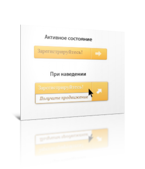 Код конечно огромный,но может кому приглинёться  Ставим туда где будет кнопка: Код <a href="#" class="a-btn"> <span class="a-btn-text">Зарегистрируйтесь!</span> <span class="a-btn-slide-text">Получите продвижение</span> <span class="a-btn-icon-right"><span></span></span> Это в css: Код a{ text-decoration:none; } .a-btn{ background:#fecc5f; background:-webkit-gradient(linear,left top,left bottom,color-stop(#feda71,0),color-stop(#febb4a,1)); background:-webkit-linear-gradient(top, #feda71 0%, #febb4a 100%); background:-moz-linear-gradient(top, #feda71 0%, #febb4a 100%); background:-o-linear-gradient(top, #feda71 0%, #febb4a 100%); background:linear-gradient(top, #feda71 0%, #febb4a 100%); filter:progid:DXImageTransform.Microsoft.gradient( startColorstr='#feda71', endColorstr='#febb4a',GradientType=0 ); border:1px solid #f5b74e; border-color:#f5b74e #e5a73e #d6982f; -webkit-box-shadow:0 1px 1px #d3d3d3, inset 0 1px 0 #fee395; -moz-box-shadow:0 1px 1px #d3d3d3, inset 0 1px 0 #fee395; box-shadow:0 1px 1px #d3d3d3, inset 0 1px 0 #fee395; padding:0px 80px 0px 10px; height:38px; display:inline-block; position:relative; -webkit-border-radius:4px; -moz-border-radius:4px; border-radius:4px; float:left; margin:10px; overflow:hidden; -webkit-transition:all 0.3s linear; -moz-transition:all 0.3s linear; -o-transition:all 0.3s linear; transition:all 0.3s linear; } .a-btn-text{ padding-top:5px; display:block; font-size:18px; white-space:nowrap; color:#996633; text-shadow:0 1px 0 #fedd9b; -webkit-transition:all 0.3s linear; -moz-transition:all 0.3s linear; -o-transition:all 0.3s linear; transition:all 0.3s linear; } .a-btn-slide-text{ position:absolute; top:35px; left:0px; width:auto; right:52px; height:0px; background:#fff; color:#996633; font-size:13px; white-space:nowrap; font-family:Georgia, serif; font-style:italic; text-indent:15px; overflow:hidden; line-height:30px; -webkit-box-shadow:-1px 0px 1px rgba(255,255,255,0.4), 1px 1px 1px rgba(0,0,0,0.5) inset; -moz-box-shadow:-1px 0px 1px rgba(255,255,255,0.4), 1px 1px 1px rgba(0,0,0,0.5) inset; box-shadow:-1px 0px 1px rgba(255,255,255,0.4), 1px 1px 1px rgba(0,0,0,0.5) inset; -webkit-transition:height 0.3s linear; -moz-transition:height 0.3s linear; -o-transition:height 0.3s linear; transition:height 0.3s linear; } .a-btn-icon-right{ position:absolute; right:0px; top:0px; height:100%; width:52px; border-left:1px solid #f5b74e; -webkit-box-shadow:1px 0px 1px rgba(255,255,255,0.4) inset; -moz-box-shadow:1px 0px 1px rgba(255,255,255,0.4) inset; box-shadow:1px 0px 1px rgba(255,255,255,0.4) inset; } .a-btn-icon-right span{ width:38px; height:38px; opacity:0.7; position:absolute; left:50%; top:50%; margin:-20px 0px 0px -20px; background:transparent url(../img/arrow_right.png) no-repeat 50% 55%; -webkit-transition:all 0.3s linear; -moz-transition:all 0.3s linear; -o-transition:all 0.3s linear; transition:all 0.3s linear; } .a-btn:hover{ height:65px; -webkit-box-shadow:0px 1px 1px rgba(255,255,255,0.8) inset, 1px 1px 5px rgba(0,0,0,0.4); -moz-box-shadow:0px 1px 1px rgba(255,255,255,0.8) inset, 1px 1px 5px rgba(0,0,0,0.4); box-shadow:0px 1px 1px rgba(255,255,255,0.8) inset, 1px 1px 5px rgba(0,0,0,0.4); } .a-btn:hover .a-btn-text{ text-shadow:0px 1px 1px rgba(0,0,0,0.2); color:#fff; } .a-btn:hover .a-btn-slide-text{ height:30px; } .a-btn:hover .a-btn-icon-right span{ opacity:1; -webkit-transform:rotate(-45deg); -moz-transform:rotate(-45deg); -ms-transform:rotate(-45deg); -o-transform:rotate(-45deg); transform:rotate(-45deg); } .a-btn:active{ position:relative; top:1px; background:#fec354; background:-webkit-gradient(linear,left top,left bottom,color-stop(#fec354,0),color-stop(#fecd61,1)); background:-webkit-linear-gradient(top, #fec354 0%, #fecd61 100%); background:-moz-linear-gradient(top, #fec354 0%, #fecd61 100%); background:-o-linear-gradient(top, #fec354 0%, #fecd61 100%); background:linear-gradient(top, #fec354 0%, #fecd61 100%); filter:progid:DXImageTransform.Microsoft.gradient( startColorstr='#fec354', endColorstr='#fecd61',GradientType=0 ); border-color:#d29a3a #cc9436 #c89133; text-shadow:0 1px 0 #fee1a0; -webkit-box-shadow:0 1px 1px #d4d4d4, inset 0 1px 0 #fed17e; -moz-box-shadow:0 1px 1px #d4d4d4, inset 0 1px 0 #fed17e; box-shadow:0 1px 1px #d4d4d4, inset 0 1px 0 #fed17e; } Картинку из архива кидаем в папку img | |
| Просмотров: 484 | Загрузок: 0 | | |
| Всего комментариев: 0 | |
|
| |