| Главная » Файлы » Прочие скрипты » CSS |
Адаптация красивых уведомлений с прогрессбаром на CSS3 by Apocalypse для uCoz
| 24.06.14, 18:45:45 | |
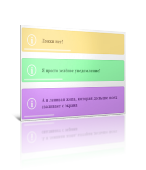 Классные уведомления на чистом CSS3. Адаптация была сделана на основе ЭТОГО материала. Мне пришлось немного модифицировать код, чтобы можно было легко пользоваться такими уведомлялками Моё тестирование в фидле: КЛИК Установка: В самый низ вашего css вставляйте: Код .tn-box { width: 360px; position: relative; margin: 0 auto 20px auto; padding: 25px 15px; text-align: left; border-radius: 5px; box-shadow: 0 1px 1px rgba(0, 0, 0, 0.1), inset 0 1px 0 rgba(255, 255, 255, 0.6); opacity: 0; -ms-filter:"progid:DXImageTransform.Microsoft.Alpha(Opacity=0)"; filter: alpha(opacity=0); cursor: default; display: none; } .tn-box p { font-weight: bold; font-size: 16px; margin: 0; padding: 0 10px 0 60px; text-shadow: 0 1px 1px rgba(255, 255, 255, 0.6); } .tn-box p:before { text-align: center; border: 3px solid rgba(255, 255, 255, 1); margin-top: -17px; top: 50%; left: 20px; width: 30px; content:'i'; font-size: 30px; color: rgba(255, 255, 255, 1); position: absolute; height: 30px; line-height: 30px; border-radius: 50%; text-shadow: 1px 1px 1px rgba(0, 0, 0, 0.1); box-shadow: 1px 1px 1px rgba(0, 0, 0, 0.1); } .tn-progress { width: 0; height: 4px; background: rgba(255, 255, 255, 0.3); position: absolute; bottom: 5px; left: 2%; border-radius: 3px; box-shadow: inset 0 1px 1px rgba(0, 0, 0, 0.05), 0 -1px 0 rgba(255, 255, 255, 0.6); } /* Colors */ .tn-box-color-1 { background: #ffe691; border: 1px solid #f6db7b; } .tn-box-color-1 p { color: #7d5912; } .tn-box-color-2 { background: #99ffb1; border: 1px solid #7ce294; } .tn-box-color-2 p { color: #2d8241; } .tn-box-color-3 { background: #dd9aff; border: 1px solid #b367db; } .tn-box-color-3 p { color: #69288b; } /* If you use JavaScript you could add a class instead: */ .tn-box.tn-box-active { display: block; -webkit-animation: fadeOut 5s linear forwards; -moz-animation: fadeOut 5s linear forwards; -o-animation: fadeOut 5s linear forwards; -ms-animation: fadeOut 5s linear forwards; animation: fadeOut 5s linear forwards; } .tn-box.tn-box-active .tn-progress { -webkit-animation: runProgress 4s linear forwards 0.5s; -moz-animation: runProgress 4s linear forwards 0.5s; -o-animation: runProgress 4s linear forwards 0.5s; -ms-animation: runProgress 4s linear forwards 0.5s; animation: runProgress 4s linear forwards 0.5s; } @-webkit-keyframes fadeOut { 0% { opacity: 0; } 10% { opacity: 1; } 90% { opacity: 1; -webkit-transform: translateY(0px); } 99% { opacity: 0; -webkit-transform: translateY(-30px); } 100% { opacity: 0; } } @-moz-keyframes fadeOut { 0% { opacity: 0; } 10% { opacity: 1; } 90% { opacity: 1; -moz-transform: translateY(0px); } 99% { opacity: 0; -moz-transform: translateY(-30px); } 100% { opacity: 0; } } @-o-keyframes fadeOut { 0% { opacity: 0; } 10% { opacity: 1; } 90% { opacity: 1; -o-transform: translateY(0px); } 99% { opacity: 0; -o-transform: translateY(-30px); } 100% { opacity: 0; } } @-ms-keyframes fadeOut { 0% { opacity: 0; } 10% { opacity: 1; } 90% { opacity: 1; -ms-transform: translateY(0px); } 99% { opacity: 0; -ms-transform: translateY(-30px); } 100% { opacity: 0; } } @keyframes fadeOut { 0% { opacity: 0; } 10% { opacity: 1; } 90% { opacity: 1; transform: translateY(0px); } 99% { opacity: 0; transform: translateY(-30px); } 100% { opacity: 0; } } @-webkit-keyframes runProgress { 0% { width: 0%; background: rgba(255, 255, 255, 0.3); } 100% { width: 96%; background: rgba(255, 255, 255, 1); } } @-moz-keyframes runProgress { 0% { width: 0%; background: rgba(255, 255, 255, 0.3); } 100% { width: 96%; background: rgba(255, 255, 255, 1); } } @-o-keyframes runProgress { 0% { width: 0%; background: rgba(255, 255, 255, 0.3); } 100% { width: 96%; background: rgba(255, 255, 255, 1); } } @-ms-keyframes runProgress { 0% { width: 0%; background: rgba(255, 255, 255, 0.3); } 100% { width: 96%; background: rgba(255, 255, 255, 1); } } @keyframes runProgress { 0% { width: 0%; background: rgba(255, 255, 255, 0.3); } 100% { width: 96%; background: rgba(255, 255, 255, 1); } } /* Let's add some different durations for the demo */ input.fire-check:checked ~ section .tn-box:nth-child(2) { -webkit-animation-duration: 6s; -moz-animation-duration: 6s; -o-animation-duration: 6s; -ms-animation-duration: 6s; animation-duration: 6s; -webkit-animation-delay: 0.2s; -moz-animation-delay: 0.2s; -o-animation-delay: 0.2s; -ms-animation-delay: 0.2s; animation-delay: 0.2s; } input.fire-check:checked ~ section .tn-box:nth-child(2) .tn-progress { -webkit-animation-duration: 5s; -moz-animation-duration: 5s; -o-animation-duration: 5s; -ms-animation-duration: 5s; animation-duration: 5s; -webkit-animation-delay: 0.7s; -moz-animation-delay: 0.7s; -o-animation-delay: 0.7s; -ms-animation-delay: 0.7s; animation-delay: 0.7s; } input.fire-check:checked ~ section .tn-box:nth-child(3) { -webkit-animation-duration: 9s; -moz-animation-duration: 9s; -o-animation-duration: 9s; -ms-animation-duration: 9s; animation-duration: 9s; -webkit-animation-delay: 0.4s; -moz-animation-delay: 0.4s; -o-animation-delay: 0.4s; -ms-animation-delay: 0.4s; animation-delay: 0.4s; } input.fire-check:checked ~ section .tn-box:nth-child(3) .tn-progress { -webkit-animation-duration: 7.5s; -moz-animation-duration: 7.5s; -o-animation-duration: 7.5s; -ms-animation-duration: 7.5s; animation-duration: 7.5s; -webkit-animation-delay: 0.9s; -moz-animation-delay: 0.9s; -o-animation-delay: 0.9s; -ms-animation-delay: 0.9s; animation-delay: 0.9s; } /* Last example pauses on hover (causes problems in WebKit browsers) */ .tn-box.tn-box-hoverpause:hover, .tn-box.tn-box-hoverpause:hover .tn-progress { -webkit-animation-play-state: paused; -moz-animation-play-state: paused; -o-animation-play-state: paused; -ms-animation-play-state: paused; animation-play-state: paused; } В любое место на странице: Код <a href="#" class="apo1">Яичное уведомление</a> <a href="#" class="apo2">Зелёное уведомление</a> <a href="#" class="apo3">Баклажановое уведомление</a> <section> <div class="tn-box tn-box-color-1"> Ложки нет!</p> <div class="tn-progress"></div> </div> <div class="tn-box tn-box-color-2"> Я просто зелёное уведомление!</</p> <div class="tn-progress"></div> </div> <div class="tn-box tn-box-color-3"> А я ленивая жопа, которая дольше всех сваливает с экрана</p> <div class="tn-progress"></div> </div> </section> Следующий код в самый низ страницы после < /body >: Код <script> $('.apo1').click(function () { $('.tn-box-color-1').removeClass('tn-box-active'); setTimeout(function () { $('.tn-box-color-1').addClass('tn-box-active'); }, 100); }); $('.apo2').click(function () { $('.tn-box-color-2').removeClass('tn-box-active'); setTimeout(function () { $('.tn-box-color-2').addClass('tn-box-active'); }, 100); }); $('.apo3').click(function () { $('.tn-box-color-3').removeClass('tn-box-active'); setTimeout(function () { $('.tn-box-color-3').addClass('tn-box-active'); }, 100); }); </script> Материал адаптирован и подготовлен Apocalypse | |
| Просмотров: 495 | Загрузок: 0 | | |
| Всего комментариев: 0 | |
|
| |